28 September 2017

Link roundup for September 2017

Best repurposing of a conference poster for the month goes to Wendy Yoder:


(For something on this Internet, this blog has not had enough cats.) Hat tip to Colin Purrington.

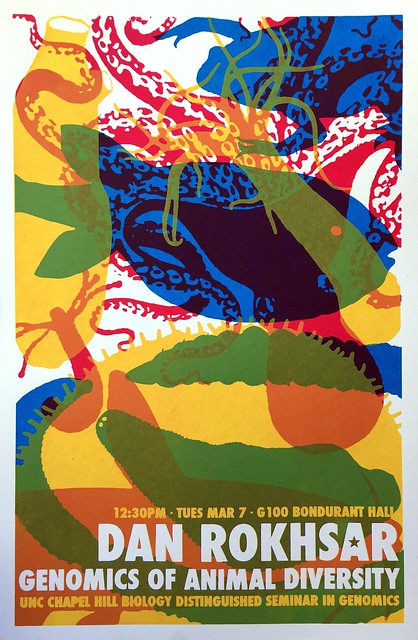
A collection of awesome seminar posters at University of North Carolina Chapel Hill. I may have featured these on the blog before... but there have been more since then, so it’s worth revisting.

Dan Rokhsar

Yun Tao (via Holly Bik) observed:

Our current crappy seminar posters (word doc, comic sans) trivialize the gravitas/seriousness of seminars.

Hat tip to Jenny Merritt and Dr. Becca.

Quote of the month from Benjamin Mazer:

“So you have to make a poster for the science fair? Didn’t you do that in elementary school?” – my mother, clearly not an academic.

Sparklines are mini graphs inserted into text, created by Edward Tufte. Now it’s easier than ever to create them with a special typeface. It’s called ATF Spark. Hat tip to Dr. Becca.

Typography jokes:


Hat tip to Janet Stemwedel.

If you have anxiety about attending conferences, try this post from the Where There Is Light blog:

This is a really difficult thing for anxious people, because new things are scary and we love to overthink and play out every worst-case scenario in our head beforehand. However, I know from experience that it is highly unlikely that any of these scenarios will ever become reality and what also helped me is to approach anxiety as excitement and chances for bravery.

Graphic design appears in a New Scientist feature, of all places. It’s a review of a Wellcome Collection exhibition, “Can Graphic Design Save Your Life?” The exhibition is feature on the Wellcome Collection website.

This is a tribute to the joy of using something well designed and well made. In this case, nail clippers.

This nail clipper was forged, not stamped out of cheap sheet metal. It wasn’t just forged, it was forged well, with machines without any rattles or squeaks, and probably inline measurement of temperature to keep the steel exactly hot enough. I don't know how to explain the shock of seeing such a skillfully forged nail clipper to someone not in the metalworking industry.  It was like seeing a dog with six legs, or opening up a lawnmower and seeing the jet engine from a 747. Nail clippers simply aren’t forged, nobody puts that much thought and quality into tools for trimming nails. ...

I took off my other shoe and sock, and trimmed those nails unnecessarily, just for an excuse to keep using this wonderful tool, all the while wondering “What is wrong with me? Why am I enjoying this chore of trimming my nails, when I could be out skiing?” That’s how amazing those clippers were.

Rounding out the month with this quote from Sophia Wassermann:

Posters: my favourite part of a conference cause of all the people & research you can see.

Me too, Sophia. Me too.


21 September 2017

Critique: Sand crab summer

Some projects show up as posters at conferences, and then are neatly converted and are published as journal papers soon after. My newest paper (Faulkes 2017)... did not happen that way. The bulk of the paper never got presented at a conference.

I featured bits and pieces of my new paper on an Ecological Society of America poster, way back in 2012. I wasn’t even there for that meeting; I had my co-author put it up. Now that I have some distance between that meeting, it’s a good time to review how it’s held up. Click to enlarge!

 
This was a big poster; seven and a half feet wide!

The graphs in this paper shows up as Figure 4 in Faulkes (2017). But one bit, the crab at the bottom of the third column, made it into a separate paper earlier (Faulkes 2014). Looking back, that picture was a bad choice. One thing I think I still like is the repetition in the four central columns: they all have a map above and a graph below, and a little explanatory text underneath. The picture in the third column breaks the pattern. Not sure if I should have tried to include it at all.

It was also dumb of me to put the photo on the right column underneath a block of text, instead of aligning it along the top with all the other images. All of the images along the top should have been the same width.

The poster is mostly grey, because the sand crabs were grey, and the maps I made were mostly grey. When you enlarge, you can see dots on the map are in brighter, saturated colours. I might have made those dots even bigger.

Although I never presented most of the data at a conference, I did use it in an example I did for a #SciFund poster class in 2016. When I do that class, I always make a poster at the same time as the students, so I am working alongside them and facing the same struggles they are. (Here’s a poster from an earlier #SciFund class.)

When I was teaching this class, I had just come back from the Evolution meeting where I had seen what has now become the most popular poster ever on this blog. I was very influenced by it and wanted to make something similarly big and simple. I’m happier with this poster today than the one above. Click to enlarge!


I still like the approach of making the picture of the animals big to act as an entry point to the poster, and staying very focused on a small number of graphs.

I’m not convinced I found the right colour palette, or typeface. The brown was lifted from the colour of the beach they are found in. The font was Sitka, which I had blogged about as being highly readable.

I made this poster in Inkscape. I struggled a lot with Inkscape. I know now that some of the things I complained about were not fair comments about the software. I was working with new software and didn’t know how to do certain things. Some of the walls I ran into were the limits of my knowledge, not of the program.

I did learn how to “export” in Inkscape, though. I managed to keep a bit better track of the “making of” than usual. Watch the poster take shape in this animation!


You can see that the big changes happen early, as I make decisions about the layout. After that, it’s mostly a lot of tweaking. Moving here, changing the colour there, rewording the text. Trifles make perfection. I may not have reached perfection here, but the degree I got close to it was due to the trifling I did.

Related posts

A poster with no conference, or: What I made in that #SciFund poster class
Critique: Anther colours
No more slidesters, part 7: Inkscape

References

Faulkes Z. 2014. A new southern record for a sand crab, Lepidopa websteri Benedict, 1903 (Decapoda, Albuneidae). Crustaceana 87(7): 881-885. https://doi.org/10.1163/15685403-00003326

Faulkes Z. 2017. The phenology of sand crabs, Lepidopa benedicti (Decapoda: Albuneidae). Journal of Coastal Research 33(5): 1095-1101. https://doi.org/10.2112/JCOASTRES-D-16-00125.1

14 September 2017

Critique: C’est difficile

Contributor Abigail Kelly is the maker of today’s poster. She bemoans that she never gets feedback on them. Well... we aim to please here on the Better Posters blog. Click to enlarge!


I hate to say it, but Abigail’s poster shows the lack of feedback. There are many problems that I have featured on the “Key posts” on the blog’s sidebar.

  • Uneven columns, contributing to unclear reading order. (Do I go across in rows, or down?)
  • Very narrow margins, and noticeable uneven ones, too.
  • Boxes around everything.
  • A barrage of bullet points. The bullets are disproportionately large, and not aligned with the first line of text, as is standard.
  • Uneven logos bookending the title.
  • The tables are in a data prison.
  • Vague and generic title.

My first thought was that the best approach to this poster was to blow it up, take it as a lesson learned, and start over.

But my second thought was, “That’s not in the spirit of the blog.” The spirit of this blog is that you can always find ways to make an existing poster better.

I went back to my usual first step when I try to improve a poster: take out the trash.

First, I cleaned up the top. I ditched the logos to create space to rearrange the title and author credit. I also shrunk the main image in the upper left, which needed more white space around it. I probably could have shrunk that diagram down even more.


Then, I got rid of the boxes, and the vertical lines in all the tables.


The hardest bit was figuring out what to do with the icons in the methods. They were too big, and didn’t line up with the text, or each other. I didn’t want to get rid of them entirely, because they added some much needed colour to the poster. I decided to shrink them way down, and lined up each with the top line of the paragraph they were in.


Finally, after removing a lot, I added one thing to the poster.

Shrinking the method icons had helped reveal the structure of the poster. The “Methods” and “Results” now have a clear margin between them. But I wanted another visual cue to indicate the different sections of the poster. I also wanted to add in a little more colour.

Using an eyedropper tool, I picked up some red from the main figure in the top right, so the colour was consistent with what was already on the poster. Then, I used an artistic brush tool to paint a line above each main heading. That the intensity drops off as the stroke moves right gives the line a bit of an organic feel, so that it isn’t a rigid rule.


This poster still has many issues. There’s still too much text, and the irregular column structure is problem. But with these changes, the poster is starting to look organized.

Here’s an animation so you can see the changes a bit better.


Down the road, it might be a good exercise for Abigail to revisit this poster. Start with the same material, and quickly knock out a new version. I did this to one of mine here.

07 September 2017

Critique: Community influence

Today’s poster was sent in by kindly contributor David Selby. It was created for the useR! conference in Brussels earlier this year. Click to enlarge!


The main data visualization gives this poster a strong graphic element at its core. The visulizations almost look like abstract art. David did the right thing by making these as big as possible. You wouldn’t be able to interpret these otherwise.

David has skillfully mixed both a serif and sans serif font in the type in a way that is not distracting.

There may be a mild problem with reading order. Looking at the text, this was the pattern I expected to follow:


Instead, I realized that I was supposed to go like this:


In fairness, the acknowledgements can be skipped, so I don’t have to drag my eyes all the way back to the lower left. But still, I was confused when I realized that black of text was acknowledgement. “Wait, I’m not supposed to read this yet!”

David was very clever to link the “Web of Science” data and “Statistics” data using colour. But it still bothers me that the two “Statistics” graphs are spatially separate, rather than adjacent.

David has a brief blog post about the poster, and wrote:

One of the key things when doing the analysis was to keep everything reproducible. To this end, all code for the graphs and results is presented in a GitHub repository and vignette, along with the Scribus file for the poster itself. All software used was free and open source. Modulo the raw data, anybody can recreate the design and repeat the analysis for themselves. I also used the vignette to track my ideas during the design process and list some sources of inspiration, even though it’s not really relevant to the actual research.

 Here is the poster on the board (photo: Oscar de León):


I am pleased to report that this was an award winning poster: first place (shared with two others, like the Nobels)!

External links

useR! poster: ranking influential communities