Braeden notes:
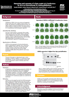
The poster theme colors had to fall within ASU’s maroon, gold, black and white color palette. The western blot in the results section is only a placeholder that I found online. I’m still waiting on my western blotting results but wanted to see how it would look now.
There is a lot to like about this poster. The two column layout is crisp from a distance. Up close, though, you notice that the left hand labels for the figure break through into the left column, rather than staying contained where they ought to be.
The left hand side is nothing but text, but it is typeset well enough. The text is big enough to be readable, has wide margins, and clear subheading that remove some of the intimidation factor.
This poster is a nice follow-up from the last entry about the design problem inherent in collaborative posters. In this case, it’s not the authors so much that are the problem as the institutional affiliations. The affiliations are chewing up for more space than I would like in the title bar.
There are five affiliations given. But four of them are different schools within the same institution, Arizona State University. I would cut the author affiliations down to lines: the university and the institute. Yes, you lose information about the schools, but I’m not sure anyone in the audience cares. You could then put the institutions on one line, freeing up more room for the title.
Speaking of the title bar, I have no love lost for logos bookending the title. The left institute logo looks like it has been distorted and squished horizontally. But I’m even more baffled here that the ASU logo is repeated at the bottom of the poster. And in an optically heavy black box, no less.
The use of the campus’s colours works well. Generally, campus colours have been picked by pros to go together. They are a good way to provide a subtle bit of branding that doesn’t chew up space. I have no clear idea if there is any reason why some of the bars are in gold and some are in maroon. It seems like the gold might be trying to highlight the main messages, but it’s a muddied signal (if that is the intention) at best.


No comments:
Post a Comment